
Apple Wallet UI/UX Redesign

Overview
As part of my Advanced Product Design course at Tufts University, I was asked with finding a physical product with an embedded digital software and creating a modification that could improve its usability. For my project, I decided to add organization features to the Apple Wallet application.
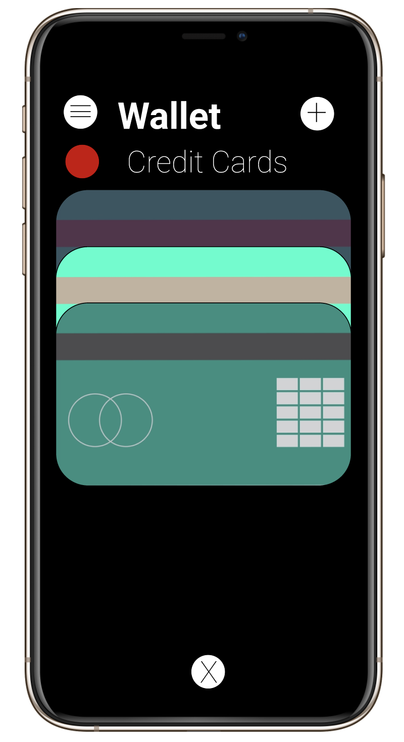
The Apple Wallet is an application on Apple devices that can help organize credit cards, event tickets, IDs, and more, similar to a physical wallet. While incredibly useful, there are areas for improvement, and I addressed the need for an organization tab.
For this project I ideated organization features, drew low-fidelity paper prototypes, conducted user testing, and developed high-fidelity figma prototypes.
My final presentation can be viewed here.
Roles:
Researcher
UI/UX Designer
Time:
4 Weeks
Methods:
User Research
Surveys & Interviews
Sketching
User Testing
Prototyping
Tools:
Figma
Google Suite
Objective
The main question asked with this project was: How can the apple wallet application’s interface be improved to include organization and promote efficiency?
Process
I first needed to identify what my modification would be and how the organization would be easily identifiable. By speaking with current users, I determined that a button in the top left corner that would bring up a screen of different categories associated with different colors for each type of item would help users.
To test this idea, I first developed low-fidelity paper prototypes that would be user tested. These prototypes consisted of paper, sharpies, and scissors to create the interface.
See below for pictures of the low-fidelity prototypes.


After completing the prototype, I conducted user tests. These tests provided valuable insights into how the prototype could be improved when it becomes digital.
Some feedback from users included the desire to have all six categories on one screen instead of needing to scroll vertically when attempting to access them. Additionally, users suggested having the descriptions of the categories be horizontal and take up the whole screen when the categories button is clicked so that it could be read with ease. These users also suggested that the app would be easier to navigate if the colors for the categories were present even while out of the categories screen.
Limitations of this prototype and user test included the following:
Users were unable to see the complete flow of the app as it was all presented at once and users could not freely switch between screens.
Colors did not pop out as much as it was not clear to see what colors would work well together.
These colors did not take into consideration those who have visual impairments.
This prototype did not allow users to see how large, what font, and other factors the text needed to be.
Scrolling was represented as multiple sheets of paper instead of natural scrolling as a phone.
See below for pictures of the user tests.


Based on this information, I then developed a high-fidelity prototype in Figma implementing my ideas with its improvements that addressed the idea of organization within the app.
This prototype consisted of various screens including the home, general categories, and some of the individual category screens.


After completing this prototype, I had the same users work through this application to gain insights and information. They enjoyed this new feature and wished that they could use it in the actual application.
Feedback from users included the desire to click on the words as well as the colors on the category screen in order to access the individual categories. Additionally, the users suggested that since the application is based off a pre-existing app in the iPhone, the colors should be modified to match the existing aesthetics of Apple or give users color customization options.


Summary
If I had more time with this project, I would have loved to go back and address the feedback from users. I would have developed more pages, modified the category colors, and made the app more aligned with the rest of the pre-existing Apple applications.
While I had limited time with this project, I learned about the various ways in which users like to customize their interfaces and colors on their mobile applications. I gained insight into how to address user needs in applications that deal with sensitive and valuable information. Furthermore, I gained a new perspective into how users look at low-fidelity prototypes and high-fidelity prototypes.
I hope you enjoyed learning about my Apple Wallet project. If you would like to hear more about this project, please do not hesitate to reach out to me!